[Shrink's] Icon Ideas
- The Silent One
- Graphics
- Posts: 1129
- Joined: Tue Jul 01, 2003 8:27 pm
Re: [Shrink's] Icon Ideas
I see that there is a connection between space elevator and planetary ring and thus a likeness of the icons makes sense, but nonetheless I would not recommend reusing the icon of the latter. The space elevator icon itself has a lot of detail, an icon that reuses it is bound to be hard to recognise in-game. - You could try to combine it with the (planet?) sphere of self-gravitating structures... nice job on that icon, anyway!
If I provided any images, code, scripts or other content here, it's released under GPL 2.0 and CC-BY-SA 3.0.
- shrinkshooter
- Space Kraken
- Posts: 198
- Joined: Fri Feb 22, 2008 8:40 pm
- Location: Teh Intarwebz
Re: [Shrink's] Icon Ideas
Thank you, I appreciate your positive feedback. It is necessary if I am to continue these icons on the right paths.
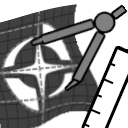
pd, I tried making the previous econ-blueprint icon look like a piece of paper with a ruler and compass. I don't know if this is what you had in mind, but it's what came up off the top of my head. The "paper" is outlined in white.
I will keep messing around with the planetary ring idea.
pd, I tried making the previous econ-blueprint icon look like a piece of paper with a ruler and compass. I don't know if this is what you had in mind, but it's what came up off the top of my head. The "paper" is outlined in white.

I will keep messing around with the planetary ring idea.
Photobucket account for FreeOrion and List of Techs and Icons
[[[===LEAN, MEAN, PURPLE AND GREEN MACHINE===]]]
[[[===LEAN, MEAN, PURPLE AND GREEN MACHINE===]]]
Re: [Shrink's] Icon Ideas
I think the space elevator is good as well, and using parts of another icon aren't bad persay, but that is such a large part of a different icon that I would try for something more unique. Just my 3.5 cents  And apparently you posted right while I was posting so let me say that your blue printing one lookes great, just maybe a little flat. Still great though.
- shrinkshooter
- Space Kraken
- Posts: 198
- Joined: Fri Feb 22, 2008 8:40 pm
- Location: Teh Intarwebz
Re: [Shrink's] Icon Ideas
Yes, it is, but touching it up would take a bit of time. That bit of time may be wasted if this isn't what pd wants, so If I am to do this right, I won't waste my effort on this unless he gives me the go-ahead. If this idea is totally off, then any improvements I make to this specific icon have a good chance of going to waste. On the other hand, since I have nothing much to do at the moment...Redcap wrote:And apparently you posted right while I was posting so let me say that your blue printing one lookes great, just maybe a little flat.
Photobucket account for FreeOrion and List of Techs and Icons
[[[===LEAN, MEAN, PURPLE AND GREEN MACHINE===]]]
[[[===LEAN, MEAN, PURPLE AND GREEN MACHINE===]]]
- shrinkshooter
- Space Kraken
- Posts: 198
- Joined: Fri Feb 22, 2008 8:40 pm
- Location: Teh Intarwebz
Re: [Shrink's] Icon Ideas
I posted this last Saturday, I'm not sure if anyone saw this cause I editted the post.  So, bumped for new material:
Reworked blueprint icon:

A couple more galactic infrastructure ones:


Finally (none too pleased with it, even though it took the most time):

This icon is only an example. I know pd told me to stay away from things this pictorial. But for the life of me, it's driving me nuts. I don't want it to look like all the other orbital techs (which, btw, need tweaking so they look uniform). But as far as coming up with symbolic representation for a ring of space elevators, everything seems to be a no-go. I'm getting annoyed trying to make this thing so I'd like to pass this one off to redcap, and see what he comes up with by toying around with it.
Reworked blueprint icon:

A couple more galactic infrastructure ones:


Finally (none too pleased with it, even though it took the most time):

This icon is only an example. I know pd told me to stay away from things this pictorial. But for the life of me, it's driving me nuts. I don't want it to look like all the other orbital techs (which, btw, need tweaking so they look uniform). But as far as coming up with symbolic representation for a ring of space elevators, everything seems to be a no-go. I'm getting annoyed trying to make this thing so I'd like to pass this one off to redcap, and see what he comes up with by toying around with it.
Photobucket account for FreeOrion and List of Techs and Icons
[[[===LEAN, MEAN, PURPLE AND GREEN MACHINE===]]]
[[[===LEAN, MEAN, PURPLE AND GREEN MACHINE===]]]
- The Silent One
- Graphics
- Posts: 1129
- Joined: Tue Jul 01, 2003 8:27 pm
Re: [Shrink's] Icon Ideas

I think this is a winner!

The composition here is good; the planetary ring looks vast and impressive. However, the monochrome planet seems inconsistent with the grey-scale ring. Also, the ring has a white outline while the planet has a black one... I don't think that works particularly well.
If I provided any images, code, scripts or other content here, it's released under GPL 2.0 and CC-BY-SA 3.0.
Re: [Shrink's] Icon Ideas
The planatary ring looks like a great concept  just needs a little more polish.
Re: [Shrink's] Icon Ideas
Colonial Economic Blueprinting

All those tiny things speak against good logo/graphic design, but I think it still works for this icon.
A compass or ruler is perhaps not even needed. The idea was still worth to explore. I think your late attempts regarding this icon are a bit too cartoony somehow.
I hope you don't mind me posting in your thread, but I've used one of your icons as a starting point.
- shrinkshooter
- Space Kraken
- Posts: 198
- Joined: Fri Feb 22, 2008 8:40 pm
- Location: Teh Intarwebz
Re: [Shrink's] Icon Ideas
Nope, that's fine. The thread is meant for discussion/anything pertaining to icons I'm screwing around with. The only problem I see with the icon you've made above is that these small lines won't show up very well ingame, which is the exact problem that was pointed out to me when I made the very first rendition of it. Still, I have a strong feeling we're heading in the right direction. I'm just not too certain how to proceed from here; I suppose I could take your icon above and try making the lines thicker/more pronounced, or perhaps tone down the detail a little.pd wrote:I hope you don't mind me posting in your thread, but I've used one of your icons as a starting point.
Photobucket account for FreeOrion and List of Techs and Icons
[[[===LEAN, MEAN, PURPLE AND GREEN MACHINE===]]]
[[[===LEAN, MEAN, PURPLE AND GREEN MACHINE===]]]
Re: [Shrink's] Icon Ideas
A quick tip: practice having less than 3 distinct things going on in a picture.
edit:
You may or may not be aware of this, but there are 8 more icons to do at the time of this writing:
Distributed Thought Computing
Galactic Infrastructure
Orbital Factories
Planetary Ring
*Stabilized Hypergrowth
Colonial Economic Blueprinting
*Deep Green
Fleet Logistics
*asterisks denote an icon that AFAIK currently has a nominee waiting in the tech icon dump.
Last edited by Josh on Mon Jun 02, 2008 3:15 pm, edited 2 times in total.
Re: [Shrink's] Icon Ideas
See what your galactic infrastructure looks like with the three icons in the three different areas without and the galaxy in the middle, but without the circle with the lines rotating inward. Just a simplier looking icon in other words.
Re: [Shrink's] Icon Ideas
I have a couple of ideas...

Deep Green

Stabilized Hypergrowth
...and a revision ...

Economic Etheralization
So... Wanna brainstorm?
Yes... it is the same post...
Deep Green
Stabilized Hypergrowth
...and a revision ...
Economic Etheralization
So... Wanna brainstorm?
Yes... it is the same post...
- shrinkshooter
- Space Kraken
- Posts: 198
- Joined: Fri Feb 22, 2008 8:40 pm
- Location: Teh Intarwebz
Re: [Shrink's] Icon Ideas
Just posting to let you know that i am around, but doing icons right now isn't my priority. Your stablized hypergrowth looks great, but the one I've already done tries to stay in keeping with the other economic graph charts. If you're dead set against that, try takin what I did and make the graph level off, for reasons I've posted several times. You could probably find the main post about this tech that I made a while ago if you look around.
For distributed thought computing, perhaps we can use the icon I made a while back (pd's suggestion actually). You can find it a page or two back in this thread. If we don't use it that's ok, but I'm not going to concentrate on that tech because I feel that the 3-brain icon thing is my contribution towards it. Hopefully if it's not used for the tech it will give someone ideas.
For distributed thought computing, perhaps we can use the icon I made a while back (pd's suggestion actually). You can find it a page or two back in this thread. If we don't use it that's ok, but I'm not going to concentrate on that tech because I feel that the 3-brain icon thing is my contribution towards it. Hopefully if it's not used for the tech it will give someone ideas.
Photobucket account for FreeOrion and List of Techs and Icons
[[[===LEAN, MEAN, PURPLE AND GREEN MACHINE===]]]
[[[===LEAN, MEAN, PURPLE AND GREEN MACHINE===]]]
Re: [Shrink's] Icon Ideas
Ideas. Hah. I get it, that's funny 
I think the brain thing for distributed thought works fine.
(your) Stabilized hypergrowth is good, IMO. I have no problem with it. Why not put it in the tech dump?
No real constructive criticism for galactic infrastructure. I'm overly fussy sometimes, and I believe I'm not the best third party to ask.
But if you do want to do icon stuff in the future, there will still be plenty for left when you get back.
- shrinkshooter
- Space Kraken
- Posts: 198
- Joined: Fri Feb 22, 2008 8:40 pm
- Location: Teh Intarwebz
Re: [Shrink's] Icon Ideas
Urgh...well, I'm back. I look over the last stuff I posted in this thread and it makes me want to "run away, run away" (monty python, people). Mainly because I'm out of ideas, but I'll try screwing around with galactic infrastructure again and see what I can do about the economic blueprinting. I don't know how much further I can go with this stuff, but that's what you guys are here for, right?
I'll get back to this and slap down some graphics a little later.
I'll get back to this and slap down some graphics a little later.
Photobucket account for FreeOrion and List of Techs and Icons
[[[===LEAN, MEAN, PURPLE AND GREEN MACHINE===]]]
[[[===LEAN, MEAN, PURPLE AND GREEN MACHINE===]]]