0.4 ship design UI

Development of artwork, requests, suggestions, samples, or if you have artwork to offer. Primarily for the artists.
Post Reply
Message
Author
User avatar
pd
Graphics Lead Emeritus
Posts: 1924
Joined: Mon Mar 08, 2004 6:17 pm
Location: 52°16'N 10°31'E

0.4 ship design UI

#1 Post by pd »

This thread is to discuss and develop the ship design screen. Please make yourself familiar with the complete 0.4 design pad, if possible. The most relevant part to this topic is quoted below.
Ship designs consist of a hull, and the parts placed in that hull's slots. Both the hull itself, and the parts placed in it may affect a ship's characteristics in-game.

Hulls

A hull is the base on which a ship is built. A hull is essentially built around an engine, so the engine is a part of the hull and is not separately selectable, and various hulls include engine-type properties.

* Each hull is visually distinct from other hulls.
* Hulls set base or default levels to various ship meters and/or non-metered ship properties. These may include:
o Speed on battle map (fueled and unfueled)
o Fuel capacity and regeneration rate
o "Health" or "Structural Strength"
o Speed on battle map
o Stealthiness and penalties to stealth while moving

Size

* Hulls will be labelled with a "size" that is of some significance strategically or in balancing. Sizes are tenatively: Small, Medium, Large, or Huge.
* Basic characteristics of a ship should be clear from just its size, regardless of the details of its design or its specific hull
* Hulls of a particular size tend to have some common characteristics and uses. The various hulls will be balanced so that all sizes (and all hulls within each size) are useful and an optimal fleet will have a variety of the available sizes, doing different roles.
* Ship size will likely have some relevance to tactical balance. Ships of different size may be differently useful for different jobs in battles, and may be differently useful overall in battles, offset by cost or non-battle considerations.

Parts

* Parts are the means by which players customize ship designs and make them into functional ships.
* Parts include things such as weapons, defenses, stealth enhancements, detection enhancements, extra fuel storage, colony pods, troop pods, and various effects-projecting (in battle and on the map) special mission equipment.
* Parts can have effects that alter ship properties, both statically and depending on what the ship is doing.
o Weapon parts might reduce stealth while firing
o As many static functions of parts as possible should be implimented through effects

Slots

* Hulls have a set number, layout (and possibly sizes) of slots into which parts may be placed to make a ship design.
* Slots are either internal or external.
o External slots are more likely to be damaged by weapons fire hitting the ships.
o Some parts may be restricted to only internal, or only external slots.
* Slots may or may not (TBD) have a "size". If slots are sized, parts would also be sized, and would require an equal or larger sized slot to be placed.
o If slots have a size, it may be possible to place multiple smaller parts into a single larger slot.

Justification

Linking hull sizes indirectly to roles via non-role-specific size-dependent characteristics of the hulls of a particular size is a part-way solution between fully generic hulls with no role-association, and fully specialized hulls, which are each intended for use only on a single role.

There will be several different (sized) hulls on which ships can be designed, which are distinctive in that they are better or worse in ways that affect how well they do various roles, but can be used for roles including ones they aren't partciularly well-suited. Different-sized hulls are also visually distinct and will have obvious associated characteristics, which should be easy to describe, discern and understand for players, rather than fully role-independent generic hulls which have no association to particular roles. In this system, it's not as easy to see what a ship is or can do as it would be if there were easy-to-see roles inherent in the ship's form or appearance, but it's better than having no information such as might occur with fully generic hulls.

Having different slot sizes allows easier balancing and allows greater distinction between different ship shapes of the same size, by allowing a distinction between four small slots and one large slot that could hold four small parts. For example, "large" ships might have two "medium" internal slots, but only "huge" ships would have "large" slots that are required for some parts that it is desired to restrict only to "huge" ships.

By having multiple smaller parts in one larger slot, we can let a design have many parts, without letting the design have many different parts. By reducing the variety of parts in a single design, we simplify the battle UI.
So, what do we need?

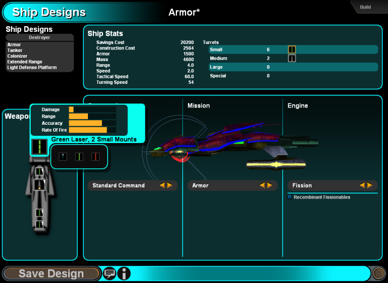
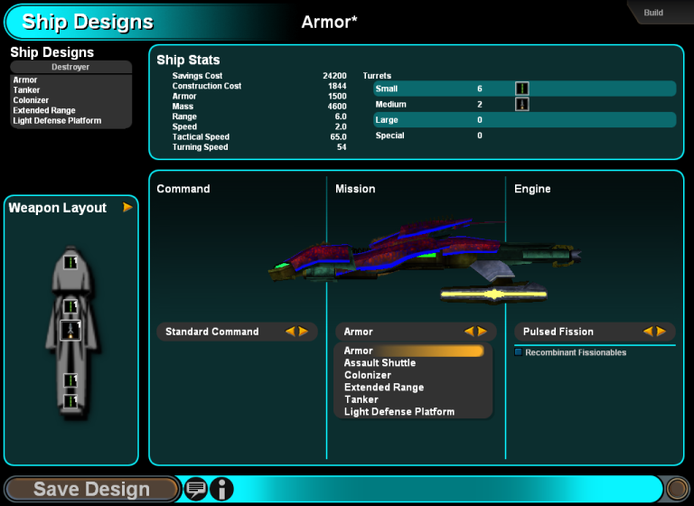
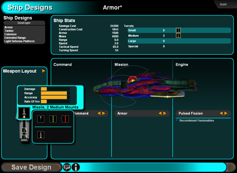
First off, we need a way to create a new design or to choose from a current design(either pre-made, if there are any or previously user created) to modify it. Since there may be quite a lot designs in mid - late game, those could be arranged in some kind of a list, maybe similar in size as the tech queue on the research screen. Once a design is done, it needs to be saved, which in return will make it part of the list. Each item should have a name, a small picture of the hull the design is based on and some additional information like size, role, hitpoints, strength, speed, range etc.

When the Player decides to create a new design, there has to be a way to choose a hull as a base. Hulls are available in different sizes and are always coupled with a certain engine and a certain amount of slots. Once a hull is selected it should be presented in an appropriate size on the screen, perhaps using the 3d mesh used for combat but toned down or perhaps just a render of it. There should be an area holding general information about the selected hull, the engine and perheps the hull's purpose. Most important however is the representation of slots. Are they laid-out on a 2D plane or in 3D space? There is a distinction of internal and external slots, which could be visualized using 2 colors and/or 2 different kinds of frame/slot graphics.

Those slots get filled with certain parts and I guess, there will be quite a lot of them. Parts could be visualized, with a picture(fitting into a slot) and a name. There should also be an area that holds detailed information about the selected part. This changes, as another part is selected.
There are different categories of parts and this should be presented in some way. Availably parts could be arranged in a grid to use the available space more efficiently than a list does.
I think the most straightforward way to assign parts to slots is by using drag and drop. It might also be necessary to do this by selected a slot and then double clicking a part. A 'drop' or 'assign' button should be avoided in my mind.

Ideally the UI should work on 800x600 but a user with a higher resolution should benefit from it, meaning that for example the list of designs and parts should grow, so that there are more items visible without scrolling.

That's all I can think of for now. I'll be back with a sketch soon. Any kind of input(textual or visual) is much appreciated. If you plan to contribute with images, keep in mind, that this is not about fancy looking UI widgets, but about getting a user interface workable with basic elements.

User avatar
Geoff the Medio
Programming, Design, Admin
Posts: 13603
Joined: Wed Oct 08, 2003 1:33 am
Location: Munich

Re: 0.4 ship design UI

#2 Post by Geoff the Medio »

Since there is no significance to where a part is located on a ship, other than whether the particular slot is internal or external, IMO it doesn't make sense to bother with a 3D layout of slots. Rather, we should probably have a 2D representation of a ship's slots and parts. This could be a simple grid (as pd noted) that can vary in dimensions, with optional gaps:

Code: Select all

   O
  OOO
  OOO
   O
 
   OOO
  OOOOO

O  O  O
  OOO
where the O are slots, which are arranged somewhat appropriately for the appearance / shape of the hull, and perhaps overlaid on an appropriate bit of art. The player could drag and drop part icons into or out of the slots to make the design

Alternatively, there could be a simple column of droplists (also as pd noted), or columns to separate internal / external, with no indication of where on the ship these parts are supposed to be. I'm not sure why this would use more space than a grid though...

[Edited by Geoff]

User avatar
The Silent One
Graphics
Posts: 1129
Joined: Tue Jul 01, 2003 8:27 pm

Re: 0.4 ship design UI

#3 Post by The Silent One »

pd wrote:Availably parts could be arranged in a grid to use the available space more efficiently than a list does.
I was thinking we could reuse the production selection window.
(I'll be back on Jan 7th, happy new year to all of you!)
If I provided any images, code, scripts or other content here, it's released under GPL 2.0 and CC-BY-SA 3.0.

User avatar
Geoff the Medio
Programming, Design, Admin
Posts: 13603
Joined: Wed Oct 08, 2003 1:33 am
Location: Munich

Re: 0.4 ship design UI

#4 Post by Geoff the Medio »

The Silent One wrote:...reuse the production selection window.
The production window has a lot of stuff that's not relevant for ship design... Ship design needs neither the sidepanel, a queue, nor a view of the galaxy map. Production is also missing stuff needed for design... It needs way to pick a hull and reset the avaialble slots, their type and positions as a result, as well as a way to just show any slots at all, their contents, and any overall summary information about the design. There also will need to be a way to browse through existing ship designs and perhaps compare them by various means with more detail than the list of buildable items on the production screen (which will include ship designs, but perhaps not with the same focus or level of detail as would be desired on the design screen).

There is a bit of shared UI though, in that there might need to be a filterable list of parts and a description of the selected part.

User avatar
The Silent One
Graphics
Posts: 1129
Joined: Tue Jul 01, 2003 8:27 pm

Re: 0.4 ship design UI

#5 Post by The Silent One »

Sorry, you misunderstood my post. What I meant was that the production selection window, not the whole production screen, could be used to select ship parts. (I didn't intend to make a suggestion how hulls are selected or parts are placed.)

Image

:arrow: From a list that can show several categories (beam weapons, missiles, sensors etc.) the player can drag/drop parts on slots (that are arranged in a 2D design like suggested above).

[Edit]
Geoff wrote:There is a bit of shared UI though, in that there might need to be a filterable list of parts and a description of the selected part.
Exactly, this is what I meant.
If I provided any images, code, scripts or other content here, it's released under GPL 2.0 and CC-BY-SA 3.0.

User avatar
utilae
Cosmic Dragon
Posts: 2175
Joined: Fri Jun 27, 2003 12:37 am
Location: Auckland, New Zealand

Re: 0.4 ship design UI

#6 Post by utilae »

I would invision the top/left half of the screen be the list as you said, where all the components are listed. And the bottom/right half of the screen be where all the slots are.

However, it's more complex then that as we may choose to have a picture of the ship, stats about the ship, etc.

Maybe we need some inspiration (from Galactic Civilizations II: Twilight of the Arnor):
Image


This is a slots type character/ship design system at its simplest (from Guild Wars):
Image

User avatar
Zanzibar
Psionic Snowflake
Posts: 470
Joined: Thu Jun 26, 2003 10:35 pm
Location: Earth

Re: 0.4 ship design UI

#7 Post by Zanzibar »

I think this would be a better way to design a ship...

Image

Note how each weapon mount can be clicked on, and selected what you want to go there. Also note how the firing arcs are displayed.

Image

In this picture, you can see that you can select different sections to go in each slot, and each one performs a unique function.

Image

Note the ship can be rotated about 90 degrees freely to show different types of arcs better...
Image

Image

chicorasia
Space Krill
Posts: 2
Joined: Tue Jan 15, 2008 12:55 pm

Re: 0.4 ship design UI

#8 Post by chicorasia »

...my first post \o/....

I like Zanzibar's suggestion.

Looks very straightforward and modular enough to accomodate different hull sizes / configurations. The pull-down menus are a great way to future-proof the parts inventories (since we don't yet know how many turrets / sensors / engines etc... there will be on the final release).

I particularly liked the command / mission / propulsion subsections - once again, it is all about modularity and flexibility.

How about tying the *mission* subsection to the ship type? - say, a Colonizer type has a "colonization module" taking up all of the mission subsection (easily justifiable, as a colony ship would need to fit supplies, heavy machinery, construction materials and acommodations for settlers), leaving only a couple external slots for defensive weapons? This would help balancing the fleets (no bomber -interceptor-colonization ships!) and allow for visual cues to the function of each ship.

ABOUT ME: fell in love with the concept of a free source game; would really like to help; not much good with concept design, pretty f****** good with 3D modeling (never done any sci-fi stuff though, mainly architectural modeling / rendering...) ... count me in for the translation to Brazilian Portuguese.

User avatar
pd
Graphics Lead Emeritus
Posts: 1924
Joined: Mon Mar 08, 2004 6:17 pm
Location: 52°16'N 10°31'E

Re: 0.4 ship design UI

#9 Post by pd »

Welcome to the project!

The concept how ship design works is not up for discussion. So a system similar to what Zanzibar suggested doesn't work for us. I am however thankfull for the screenshots anyway. I suggest to anyone participating in this thread to read through the 0.4 design pad or at least through my initial thread.
pretty f****** good with 3D modeling
That's quite a bold statement. Do you mind showing some of your work? You can email me, if you like or just open a new thread.

User avatar
Zanzibar
Psionic Snowflake
Posts: 470
Joined: Thu Jun 26, 2003 10:35 pm
Location: Earth

Re: 0.4 ship design UI

#10 Post by Zanzibar »

pd wrote:The concept how ship design works is not up for discussion. So a system similar to what Zanzibar suggested doesn't work for us. I am however thankfull for the screenshots anyway. I suggest to anyone participating in this thread to read through the 0.4 design pad or at least through my initial thread.
...and people wonder why I dropped out of this project. Sometimes, it's ok to be flexible and open to ideas, even if they are submitted a bit late... oh well... I wish you guys good luck!
Image

Image

User avatar
Geoff the Medio
Programming, Design, Admin
Posts: 13603
Joined: Wed Oct 08, 2003 1:33 am
Location: Munich

Re: 0.4 ship design UI

#11 Post by Geoff the Medio »

Zanzibar wrote:Sometimes, it's ok to be flexible and open to ideas, even if they are submitted a bit late...
We might be flexible an open to ideas if they are presented appropriately. If it can be shown that there are major problems with the current design, and detailed reasons why we need to change are given, then we might change. However, we can't reevaluate every previous decision every time someone has an idea that don't fit with / completely ignores what's already been decided, and it's unreasonable to expect that we would.

Not getting everything you want is a disadvantage, and an advantage, of working in a team.

chicorasia
Space Krill
Posts: 2
Joined: Tue Jan 15, 2008 12:55 pm

Re: 0.4 ship design UI

#12 Post by chicorasia »

pd wrote: Do you mind showing some of your work? You can email me, if you like or just open a new thread.

I finally got a chance to put together a tiny portfolio, at http://minimonstro.blogspot.com

Hope you like it...

User avatar
pd
Graphics Lead Emeritus
Posts: 1924
Joined: Mon Mar 08, 2004 6:17 pm
Location: 52°16'N 10°31'E

Re: 0.4 ship design UI

#13 Post by pd »

You've got some nice work there. Personally I don't have much experience with NPR, but I think this might come in handy for the ship design screen. I imagine maybe showing the ship in a side or top view rendered in a nice NPR way.

User avatar
pd
Graphics Lead Emeritus
Posts: 1924
Joined: Mon Mar 08, 2004 6:17 pm
Location: 52°16'N 10°31'E

Re: 0.4 ship design UI

#14 Post by pd »

It's time to get this started. I was hoping of some more input before I got around this, but oh well..

Here is a quick sketch showing basically what I've been describing above.
Image

The UI is based one the layout of the research screen, but is still quite different. At the top left corner there is a complete summary of the current design. All the important numbers go here.

Below are two buttons, one to create a new design and one to remove the selected design. Upon hitting new, the user is asked to choose a name. Upon hitting remove, there should probably be a confirmation necessary.

Again below, there is a list of all current designs. The list is scrollable and shows the hull and the most important information. The image could either be tinted down and shown in the background or made really small into an icon, which could be re-used in the production screen, the fleet manager and the combat UI.

At the top, right in the middle, there is the hull selection. There should be some textual information, talking about hull specific stats. The selection itself could work as as shown or maybe using a drop down list, which might be an even better choice. Stylistically. I'd go with an orthographic render of the ship for the hull selection.

Right next this part is an area showing information about specific parts, which can be selected below.

Stylistically I initially preferred painted/rendered images as parts, but after all this might not be worth the effort. Especially since it will look weird if you put a shiny metal laser turret on a tree- or insect-ship. So I think we should once again use rather abstract icons, similar to the tech icons(sorry Josh, it just won't stop :).

Right below or maybe on top are switches or flags to choose a part category(weapons, shield systems, special systems, etc).

The main area is reserved for the hull and it's slots. Parts are simply dragged and dropped. You can pan around this area in case a large hull might not fit into the space. I don't think zooming is necessary. It would violate the size ratio of parts shown above and slots in the ship anyway.

Stylistically, I have some kind of a "technical drawing" of the hull in mind. Actually quite similar to how ships looked in the bottom bar in homeworld 2.
The shape of the ship will decide, whether it's best to use a side, top or maybe front view of the hull an therefor how the slots are layed out. This might be noted in the image itself somewhere.

Using a larger resolution will give the benefit of a larger main area as well as a longer design list.

C&C please.

User avatar
Geoff the Medio
Programming, Design, Admin
Posts: 13603
Joined: Wed Oct 08, 2003 1:33 am
Location: Munich

Re: 0.4 ship design UI

#15 Post by Geoff the Medio »

It seems unnecessary to have a whole section devoted to just hull information and selection. Why not have hulls be one of the tabs of parts categories be the "Hulls" category? From this, you'd drag a hull onto the design to change it. There could be a differently-shaped / shaded / outlined drop-slot for the "hull", or dropping the hull icon onto the design anywhere could have the effect of changing the hull.

Alternatively, a drop-list of hulls right next to or at the side of the design itself makes more sense to me than scroll buttons or a drop list separated from the design display panel by the parts lists. This would emphasize that hulls aren't just another part by making the action to change them different (ie. drop list select instead of drag drop).

If we get rid of the extra hulls panel, and treat hulls more or less like another part for statistics displaying, then we can use the whole area you've allotted to parts and hull info to display information on whatever part of hull is selected.

Also, the parts palette and selected part info panel should probably be floating, movable and resizable over the current design display, similar to how things are set up on the research screen.

Also also, is there a better way to list existing designs? If there were a lot of designs, which is quite possible later in the game, a list of that sort would be quite difficult to use... At the least, we should have filters or sorting of some sort. Perhaps a separate fleet design library page, rather than attempting to fit that and design into one page?

Also also also, you really like ships that look like futuristic assault weapons from the side, hmm?

Post Reply